Design to Dev hand-off
Tips and tricks to streamline the design to dev handoff
This documentation is based on the state of Figma and Dev Mode as of Monday February 5, 2024. If you find information out of date, please contact the Quantum team.
As a developer, using Figma can be daunting. Finding specific information about design elements often forces you to navigate through many different mockup/interface/screen layers. In this tutorial you'll learn how to navigate layers/frames/objects/elements/components more efficiently and quickly access their corresponding information.
Table of contents
- Prerequisites
- Introduction
- Available options
- Instructions
- Quantum Design-to-Code Figma plugin (Alpha)
1. Prerequisites
- You have a Figma license or view access on a Figma file. Figma is the official design tool at Thales.
- You know the basics of a Figma design file (if not, check this introduction guide from Figma).
2. Introduction
Mockups in Figma are made of design elements. Layers, frames, objects, elements and components are interchangeable terms to talk about design elements. But, bear in mind that not all design elements are created equal in Figma. In a nutshell:
- Layers, objects and elements are common terms to talk about any design elements
- Frames are specific design elements used as "containers". A special feature called Auto Layout can be activated to apply alignment and resizing rules to a frame's child elements.
- Components are reusable design elements composed of properties (highlighted in purple color in the Figma GUI)
- Asset is an umbrella word that include components and media like images or videos (jpg, png, svg, mp4, …)
From the Figma GUI, those design elements appears in:
- The canvas (middle working area). You can see the canvas as the viewing panel of your browser where the web page is displayed.
- The layers treeview (left sidebar). You can see the layers treeview as the DOM or the element pane from the browser developer tool, where you can find folders and subfolders ("containers") composed of elements like text, containers, assets, ...
- The inspector (right sidebar). You can see the inspector as the styles pane from the browser developer tool, where you can find information about a selected element.
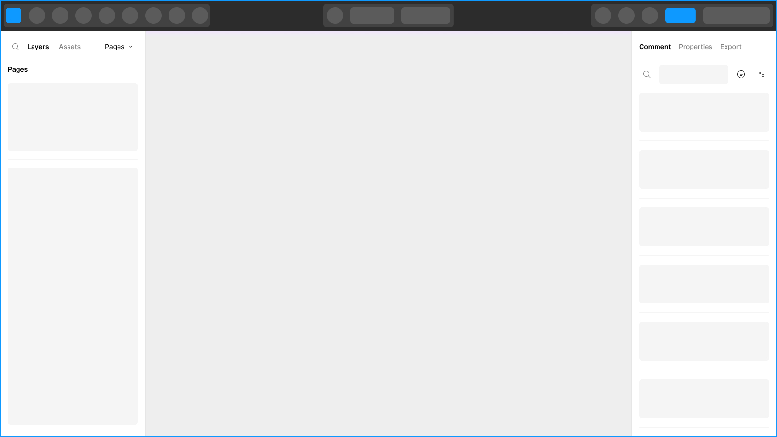 Skeleton representation of the Figma GUI from the Figma help center
Also, keep in mind that, just like in the inspect mode of your browser it can take some clicks to select the right element and access the corresponding information. But don't panic! The flow is pretty similar to how it works in the browser and Figma even developed a specific mode for developers to ease that process!
Let's now dive into the practical matter.
3. Available options
Without Dev Mode
This view of Figma is similar to the one your designer with editor access is working with. As a developer, you usually have a view-only access meaning that you can't edit but only select elements from the layers treeview (left sidebar) or the canvas (middle working area) and read their corresponding information from the inspector (right sidebar). See instructions on how to use the view-only inspect mode in Figma below.
With Dev Mode (licence required)
Dev Mode offers a dedicated view of Figma for developers including:
- Quick information surfacing when hovering over design elements
- Easy access to individual design elements from the canvas (middle working area)
- Easy access to a summary list of assets in use on a mockup from the inspector (right sidebar)
- Code snippets preview
In a nutshell, Figma built this Dev Mode as close to what you're already used to: the debug view or inspect mode depending on your development environment.
See the comparative table below for more information about the difference of experience with or without Dev Mode.
Access to Dev Mode
Dev Mode is accessible to users who already have a Figma editor licence. Users with view-mode only access or a free figma account can't use Dev Mode at all. If you don't have a Figma editor licence, you will have to request a licence for Dev Mode access to your Figma point of contact at Thales (if you don't know your Figma point of contact, you can contact Estelle Pelleterat De Borde).
Comparative table: with Vs. without Dev Mode
| Feature | With Dev Mode | Without Dev Mode (or no editor access) | Comment & Tips |
|---|---|---|---|
| Shared view of Figma between all collaborators on a project | ✅ (⚠️ see comment) | ❌ | With dev mode: designers (editors) can have the same view as their developers (viewers with dev mode access). If you need all the collaborators on a project to have the same view of Figma, all viewer-only users will need a Dev Mode licence! Without dev mode: as an editor you can't overview a file like if you were in the shoes of a viewer-only user and so have the same view as your team members who don't have a Figma or Dev Mode licence. |
| Inspect variants of a component set | ✅ | ❌ | Without Dev Mode, you can't overview the component properties and their variants at the component set level. You have to inspect each variant component individually to see the corresponding component properties. |
| Inspect properties of a component instance | ✅ | ✅ | |
| Overview of the selected component | ✅ (⚠️ see comment) | ❌ | This feature is not very useful unless Figma adds auto-generated anatomy specs (like the EightShapes Specs Figma plugin does). |
| Access to a component playground | ✅ (⚠️ see comment) | ❌ | With Dev Mode, you can play with the different variants of a component from your project file. Note that you can neither overview the component interactions (for example hover state) nor its responsive behaviour. |
| Access to layout properties (padding, gap, width and height) | ✅ (⚠️ see comment) | ✅ | From the inspector (right sidebar), in Dev Mode you can overview the layout properties with the box model. From the canvas (middle working area), in Dev Mode you can easily surface layout/spacing values from a mouse hover. Without Dev Mode, you can have access to this information using the right keyboard control: hold Option or Alt when hovering over design elements. Also, note that in Dev Mode, you can't see the gap value from the inspector (right sidebar). You have to hover over the design element from the canvas (middle working area). |
| Access to Styles or Variables | ✅ | ✅ (⚠️ see comment) | Without Dev Mode, the access to a style or variable is possible but less ergonomic. You need to select the exact layer where is applied the style/variable. Also, the name of the style/variable is not easily readable unless you hover over the value to see it in full in the tooltip. |
| Access to assets reference | ✅ | ✅ (⚠️ see comment) | In Dev Mode, access to assets reference is made easy. Without Dev Mode, it is less ergonomic, you need to select the exact layer of the asset to have the corresponding information. |
| Access to layers | ✅ (⚠️ see comment) | ✅ (⚠️ see comment) | The experience of selecting layers from the canvas (middle working area) is more flexible outside of Dev Mode. With the right use of keyboard control you can easily access granular layers or wrapper containers (see instructions on how to access layers without Dev Mode). In both cases, you can still use the layers treeview (left sidebar) to select the right layer. |
| Access to layers treeview | ✅ | ✅ | In Dev Mode, your layers treeview is filtered. You have a simplified overview of the layers but you can still open the details when you need to. |
| Access to plugins | ✅ (⚠️ see comment) | ❌ | In view-only mode, you can't use plugins at all. In Dev Mode you can load plugins that are made for Dev Mode but not standard plugins. |
| Native Figma code snippets | ✅ (⚠️ see comment) | ✅ (⚠️ see comment) | In both Dev Mode and viewer-only, you can have access to generated code in different languages (CSS, iOS, and Android). The only difference between the experience with or without Dev Mode is that without Dev Mode you don't have a preview, you have to right click on the inspected design element to then get the option to copy/paste the code in your desired language (to get more information watch the video Free Viewer Experience from Figma). Be careful, the usability of the generated code is limited. It can't really be implemented as generated by Figma. It provides hints to the developer but not the best practices and implementation guidelines for his code base. Also, it is important to note that the generated code is not Quantum compliant code (See section about the Quantum Design-to-Code plugin to get Quantum specific code from Figma). |
| Tag/Flag Pages or Sections as "Ready to dev" | ✅ (⚠️ see comment) | ❌ | In Dev Mode, there is a feature to tag/flag Pages or Sections as "Ready to dev". This feature highlights Pages or Sections that are ready for development. This adds a visual indicator from the canvas (middle working area) and creates a list of "Ready to dev" Screens that a developer can navigate through from the left sidebar. Without Dev Mode, designers used to organize their mockups in a specific Page to make it easy for developers to access the right mockups to inspect and implement. |
| Compare changes | ✅ (⚠️ see comment) | ❌ | A developer can overview the changes that happen between the latest version of a mockup or design element and a past version. However, you can't compare two past versions. Usually, designers duplicate their mockups to keep track of changes because it makes it more easy to observe, compare and document updates over time. |
4. Instructions
Without Dev Mode
You can navigate and select design elements through the layers treeview (left sidebar) or the canvas (middle working area).
When interacting with layers you might come across simple layers, Auto Layout containers or components. Components are distinguished by their purple color and Auto Layout containers by their "list" icon in the layers treeview.
With Figma components, the information of some nested elements can be available at the parent level from the properties pane in the inspector (right sidebar).
With elements that are not component but simple design elements, you will have to dig into the layers to select the right element from the layer treeview (left sidebar) or from the canvas (middle working area) to start surfacing the desired information in the inspector (right sidebar).
In both examples, you can find from the inspector (right sidebar), the name of the selected component ("Button"), the name of the parent component ("Header"), the name of the media used as a trailing icon ("save").
Generally, Figma users will use both technics in combination to get access to the right design element information.
For more information about layers in the left sidebar, visit this guide in the Figma help center
For more information about layers properties in the right sidebar, visit this guide in the Figma help center
With Dev Mode (licence required)
In Dev Mode you can still select and navigate through layers but with more ease. The main benefit of Dev Mode is that it better surfaces the individual design elements, like when your dev inspector is open in your browser.
Enabling and activating Dev Mode
To activate Dev Mode, you can turn on the toggle </> at the top-right of your Figma interface next to your avatar and the share button or use the keyboard shortcut Shift + D.
If Dev Mode is initialised for the first time, Figma will prompt you to choose a platform, a value unit and a default theme. Don't worry, what you will set is not that important because it won't produce relevant information to you in the context of Quantum and you can still change those settings afterwards.
hovering and selecting design elements from the canvas
Dev Mode facilitates the surfacing of information from individual design elements on the Canvas.
When hovering a design in Figma, you'll notice that you get better access to individual elements and don't have to click multiple times to get into nested components compared to classic mode.
When hovering design elements, you'll see that key position and alignment information are automatically surfaced.
When selecting a design element, you'll get access to all their information from the inspector (right sidebar). See the next point for more information about the inspector in Figma (by the way, you can still select elements straight from the layers treeview if you feel comfortable, see section about classic mode above).
Selecting a design elements and access all its corresponding information from the inspector
Selecting a page frame will surface information about the assets in use on that page in the inspector (right sidebar).
Straight from this assets section, in the inspector, you will be able to navigate into nested components.
The canvas and layers treeview will reflect which elements are selected (by the way, you can still select elements straight from layers treeview if you feel comfortable, see section about classic mode above).
The inspector will display different types of information including the icon(s) in use by a component.
Do not pay attention to the code snippets available in the inspector (right sidebar). They are generated by Figma and have nothing to do with the Quantum design system! For Quantum specific code, see the Quantum Design-to-Code Figma plugin.
For more information about Dev Mode, check this guide in the Figma help center
5. Quantum Design-to-Code Figma plugin
The plugin is in Alpha version and covers some components of the design system in React only.
The Quantum Design-to-Code Figma plugin helps developers connect the dots between a design in Figma and Quantum code to quickly implement components and other frontend elements with production-ready code. Developers can click any component or element on the Figma canvas to instantly get code that can be seamlessly copied and pasted into their applications.
The plugin also allows designers to get familiar with the translation of components, design elements or individual styles into Quantum-ready code snippets.
Product teams can streamline their Design to Dev hand-off and collaboration by gathering designers and developers around practical and technical materials straight from Figma and encourage them to speak a shared language.
Accuracy and consistency between the designs and code can be finally ensured!
How to use the Quantum Design-to-Code Figma plugin?
To use the Quantum Design-to-Code plugin you will need access to Dev Mode. For more information see the section about Access to Dev Mode.
How to install the Quantum Design-to-Code plugin in Figma
- Open the Figma file of your project
- By default, you are in the classic editor or view-only mode
- Enable the Dev Mode view (see Enabling and activating Dev Mode for more information)
- In the inspector (right sidebar), click on the Plugins tab at the top
- Search for the keyword "Quantum"
- Select the plugin "Quantum Design to Code"
- The Quantum Design-to-Code plugin is now active and selected
How to use the Quantum Design-to-Code plugin in Figma:
- Enable Dev Mode if not already enabled
- Select the Quantum Design-to-Code plugin if not already selected
- Now, if you select/inspect an element in your mockups, you should be able to see Quantum code in the React code preview of the inspector (right sidebar)
- It is possible that the element you selected is not covered or interpretable by the plugin, in this case the code preview will print "Code cannot be generated: Not supported component". In this case, you can try select an element that is higher or deeper in the layers treeview.
- You can switch back and forth between codegen plugins or code languages from the Language select anytime you need to (where the Quantun Design-to-Code plugin is selected) or from the Plugins tab section