Foundations
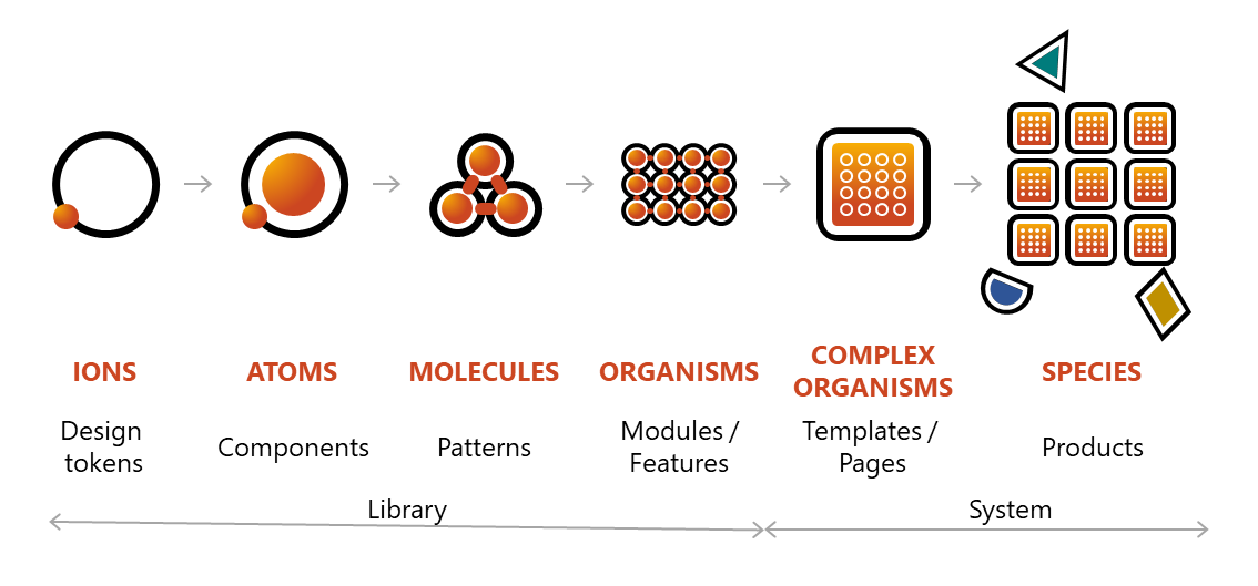
Quantum is designed based on the philosophy of atomic design. There are six levels in atomic design as shown in the graph below.
Design System
A Design System encompasses everything that our teams need to Design & Build better products, efficiently & consistently. For many it is interpreted as a company’s DNA.
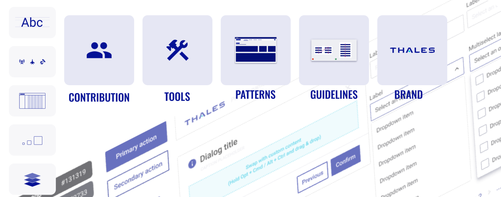
A Design System is a rich body of contents which contains design guidelines/patterns (usage, ergonomics, accessibility…), reusable/flexible assets (components, templates, brand standards, theming, colors, typography systems, layouts, elevation, stroke/border, iconography system), Design tools and more.
It organizes, shares and connects all these assets in a well-structured, and highly “consumable” way. As such, the Design System becomes the single source of Design truth for all digital products, in a way it sets a coherent eco-system of solutions which reinforces Thales credibility and positioning as a Design Leader on the market
3 Major Challenges addressed by Design Systems
1. It creates consistency across all products & services which reinforces the perception of Thales experience and premium brand status from customers and users’ point of view.
2. It scales Good Design across all product & engineering teams, ensuring a good UX Design everywhere and avoiding the creation of design/experience gaps between products that may lead to bad user experience thanks to a continuous integration of the industry’s best-in-class design standards.
3.It increases competitivity, more and more teams are embracing UX Design because our markets, customers and users request it, and our competitors are also raising their UX Design game. A design system becomes the most efficient way to implement Design across an organization. The thorough use of validated components and design patterns speed up our go-to-market and increase our competitiveness.
Discover more about Design System & Quantum
Design tokens
When it comes to building Design Systems, Tokens are key and represent named entities in which the visual attributes of the design are stored. It means that they carry all the design decisions (semantic attributes and how to use the attributes), accordingly translated into a set of platform/technology agnostic data" (JSON format). They act as “single source of Design truth” to ensure that product experiences feel unified, consistent and based on the same Design Language no matter where it is designed and built. Like variables, they are used instead of hard-coded values (ex: static values such as HEX codes for color) to support maintainability, scalability and visual consistency inside and across products.
In Quantum Design System, the source of truth is ensured published on Figma design tool. Design tokens have been defined in order to have unique references which are used to build and stylish all the components of the Design System and replace hard values.
Using tokens
When styling an element or component out side of our Quantum component library, we suggest developers to use tokens instead of hard coded values.
If @qtm/tokens package is not installed, you need to install it first. It's one of many Quantum packages that we publish.
- npm
- pnpm
- Yarn
npm install -S @qtm/tokens@latest
pnpm add @qtm/tokens@latest
yarn add @qtm/tokens@latest
You can choose between two ways to import the tokens
- stylesheet
- import from CSS
<link rel="stylesheet" href="./node_modules/@qtm/tokens/dist/tokens.css" />
@import '@qtm/tokens/dist/tokens.css';
@import '@qtm/tokens/dist/tokens-dark.css';
Example of styling an element with tokens in the HTML file:
<div class="component">
  <h1 class="header">Header</h1>
  <p class="text">Text</p>
</div>
Now you can style the elements with the color tokens in your component CSS file:
/* Using tokens in the component's style: */
.component .header {
  background-color: var(--header-container-background-color);
}

.component .text {
  color: var(--your-choice-text-color);
}

.component {
  /* use tokens for customization: */
  --your-choice-text-color: var(--color-bluegreen-600);
}
Design tokens VS CSS utilities
Tokens and CSS utilities do similar jobs. CSS utilities are built based on the design tokens. A utility is a class that be used to style an element or component in your markup, while token is a variable that used in your stylesheet.
We recommend developers to use tokens for styling elements or components outside of Quantum component library, and use CSS utilities to style Quantum components fast and easily.
Here is a guide on how to use CSS utilities to customize Quantum components.